UMRF Ventures, Inc. needed a refreshed website that clearly communicated their mission and services to prospective clients and student employees. I am responsible for creating mobile-first mockups that aligned with their brand and translated smoothly across screen sizes. I also update and optimize the site’s content to boost the site’s SEO and web visibility.
Front-End Developer, UX/UI Designer
Figma, Github, XXAMP, Visual Studio Code
March 2025-Present
I helped drive measurable improvements to the site's user experience and performance by focusing on core web principles. I addressed critical issues with mobile responsiveness and accessibility, ensuring elements rendered correctly across devices and that color contrast met WCAG guidelines. This not only enhanced usability but also strengthened the site's SEO foundation. These targeted optimizations, combined with the strategic launch of new content, directly resulted in increased user engagement and site traffic, as demonstrated by the growth in key metrics below.
increase in total site hits
increase in unique visitors
growth in total site visits
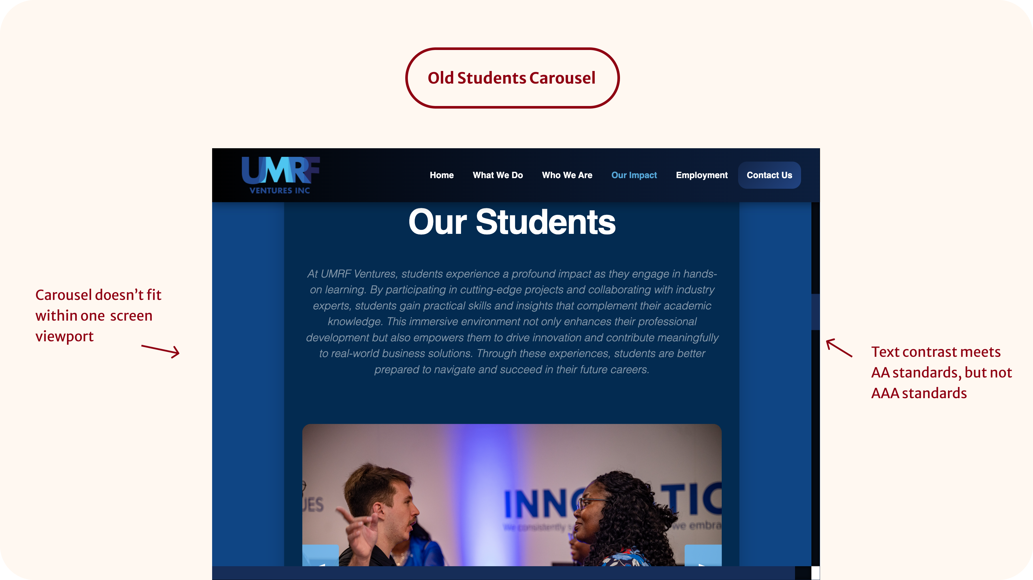
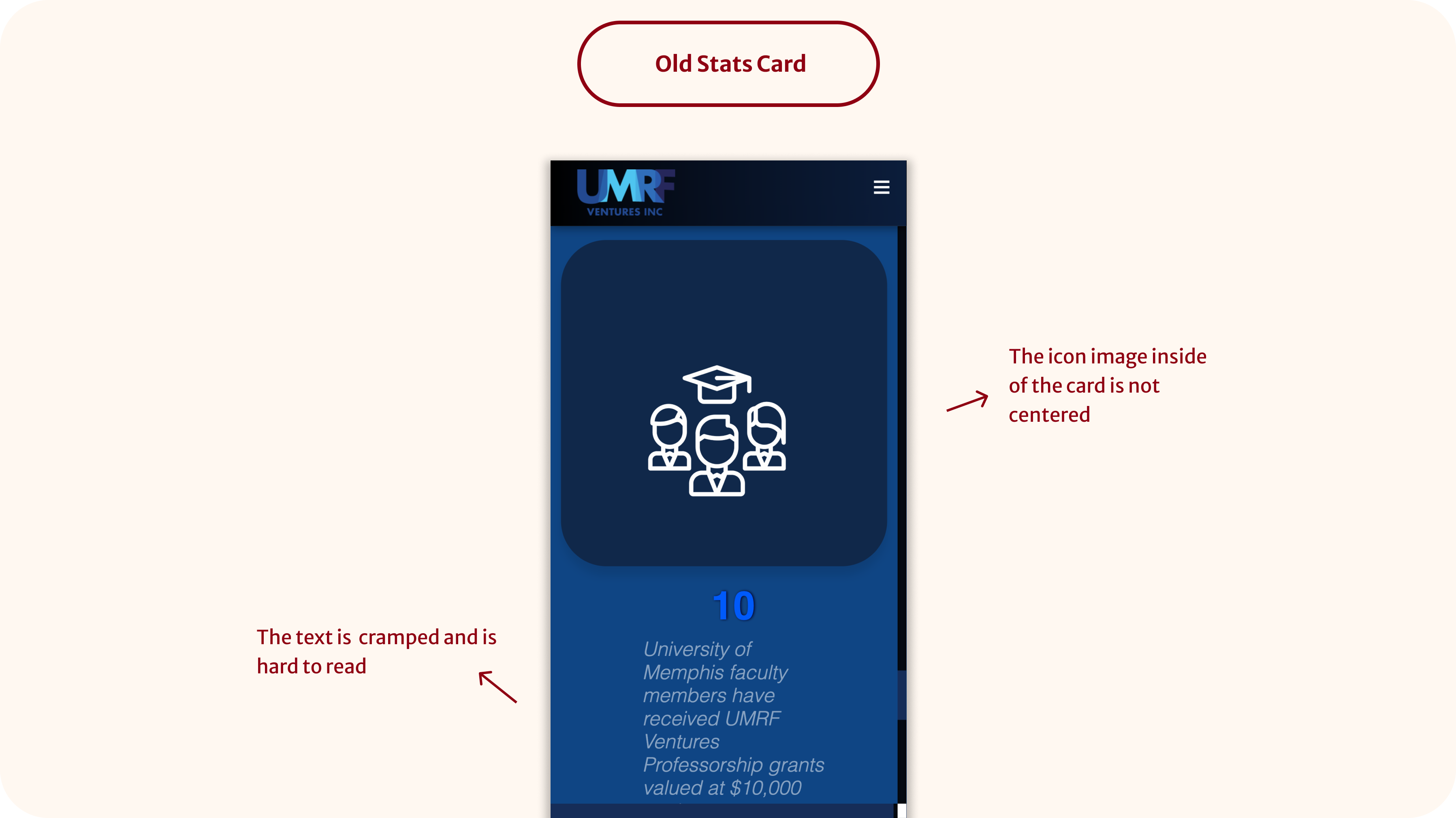
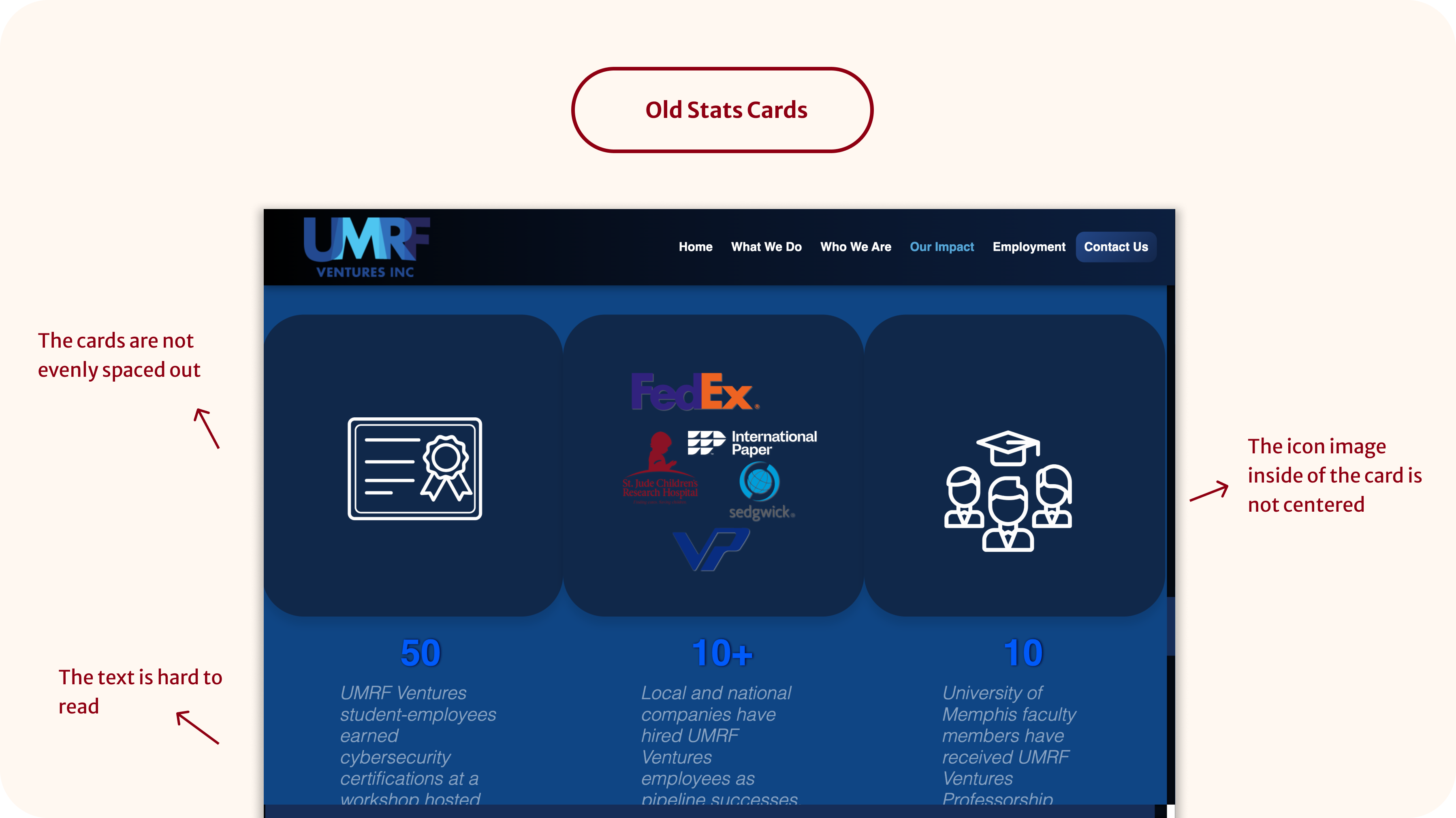
I was assigned to improve the "Our Impact" page as part of UMRF Ventures' broader initiative to modernize their website. While the page layout was structurally sound, I noticed key usability issues across both desktop and mobile, such as low text color contrast that didn't meet WCAG standards, poor visual hierarchy, and oversized components that pushed important content below the fold. These design flaws impacted the overall accessibility, responsiveness, and visibility of the site, potentially hurting SEO performance.
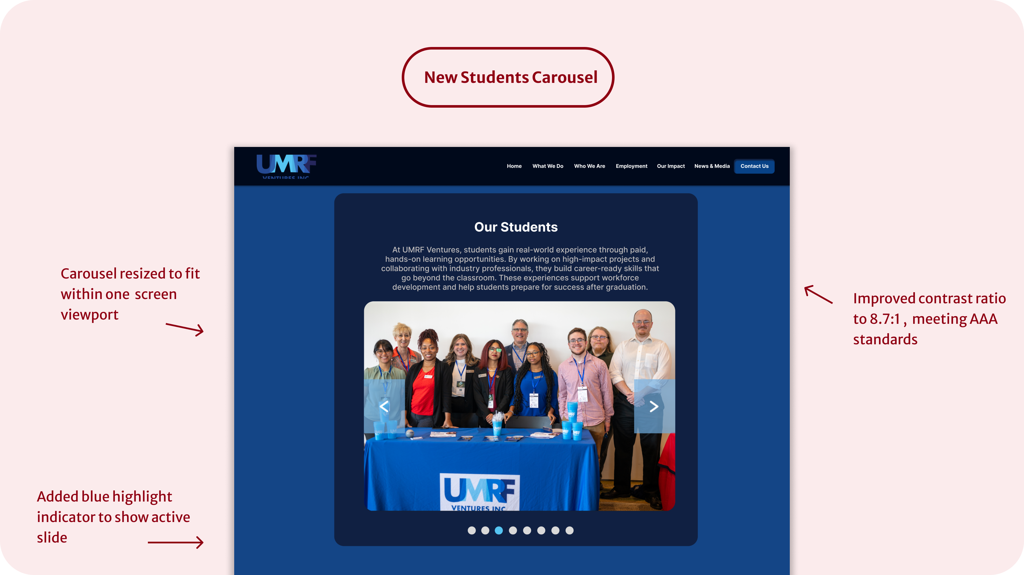
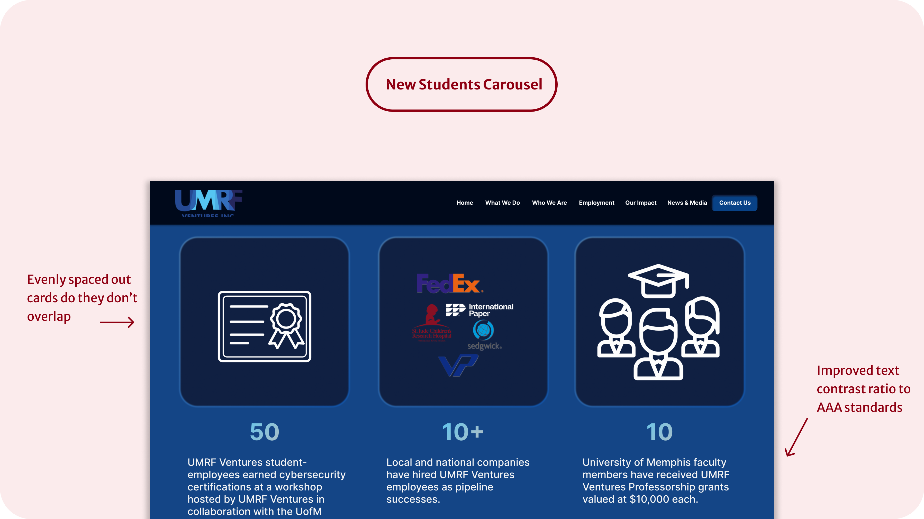
I worked with the marketing specialist and a fellow web developer to find ways to improve the user experience while staying within our brand guidelines. We agreed to scale down the "Students" and "Our Community" sections so they could fit within a single screen view, making the content easier to scan. We also added alt text to all images to improve accessibility and help boost our SEO rankings.
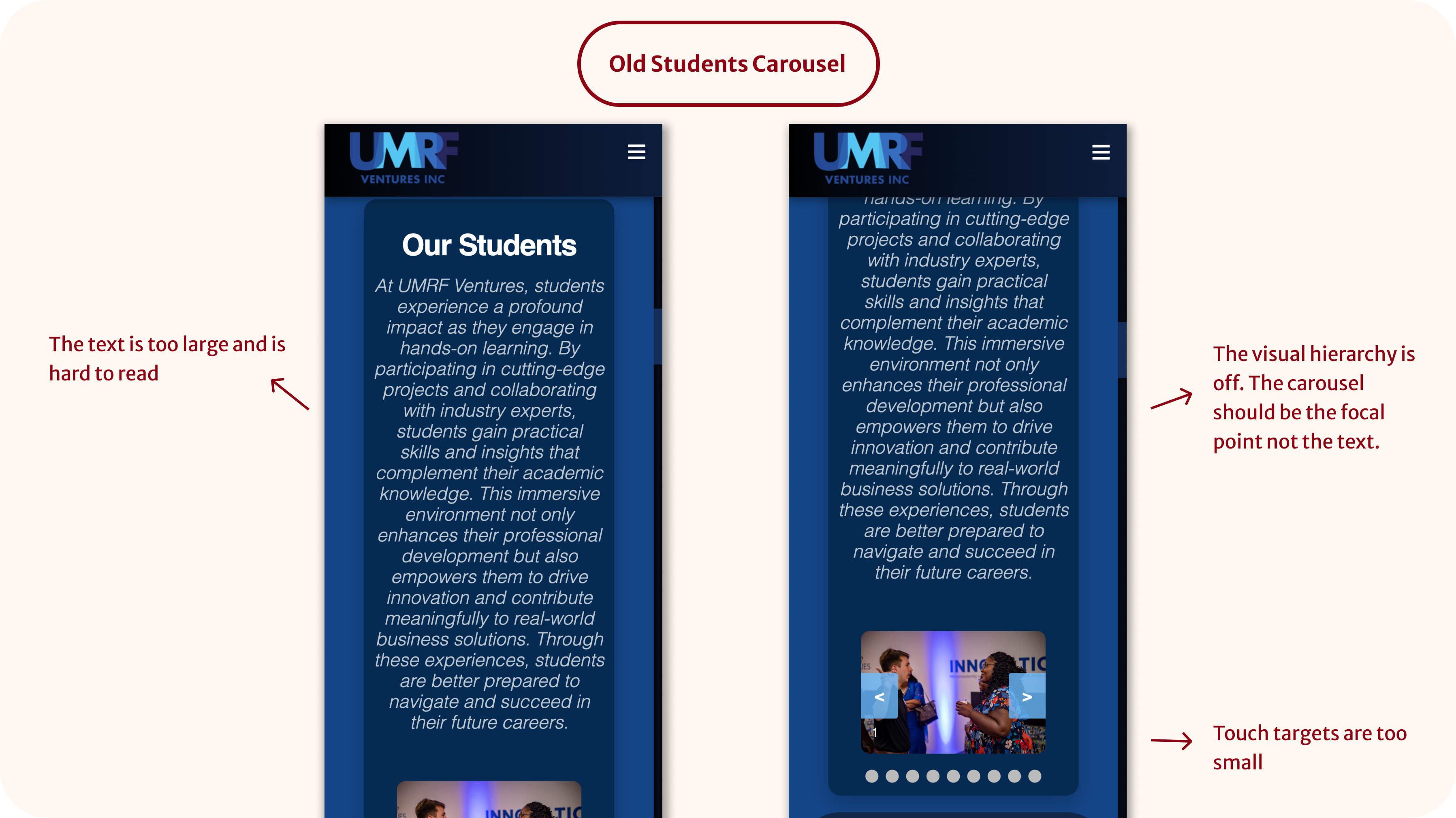
The first element I focused on was the Students carousel. In the original design, it extended off-screen on both web and mobile, making it frustrating to interact with. On smaller screens, the large text overshadowed the images, reducing visual clarity and hierarchy.
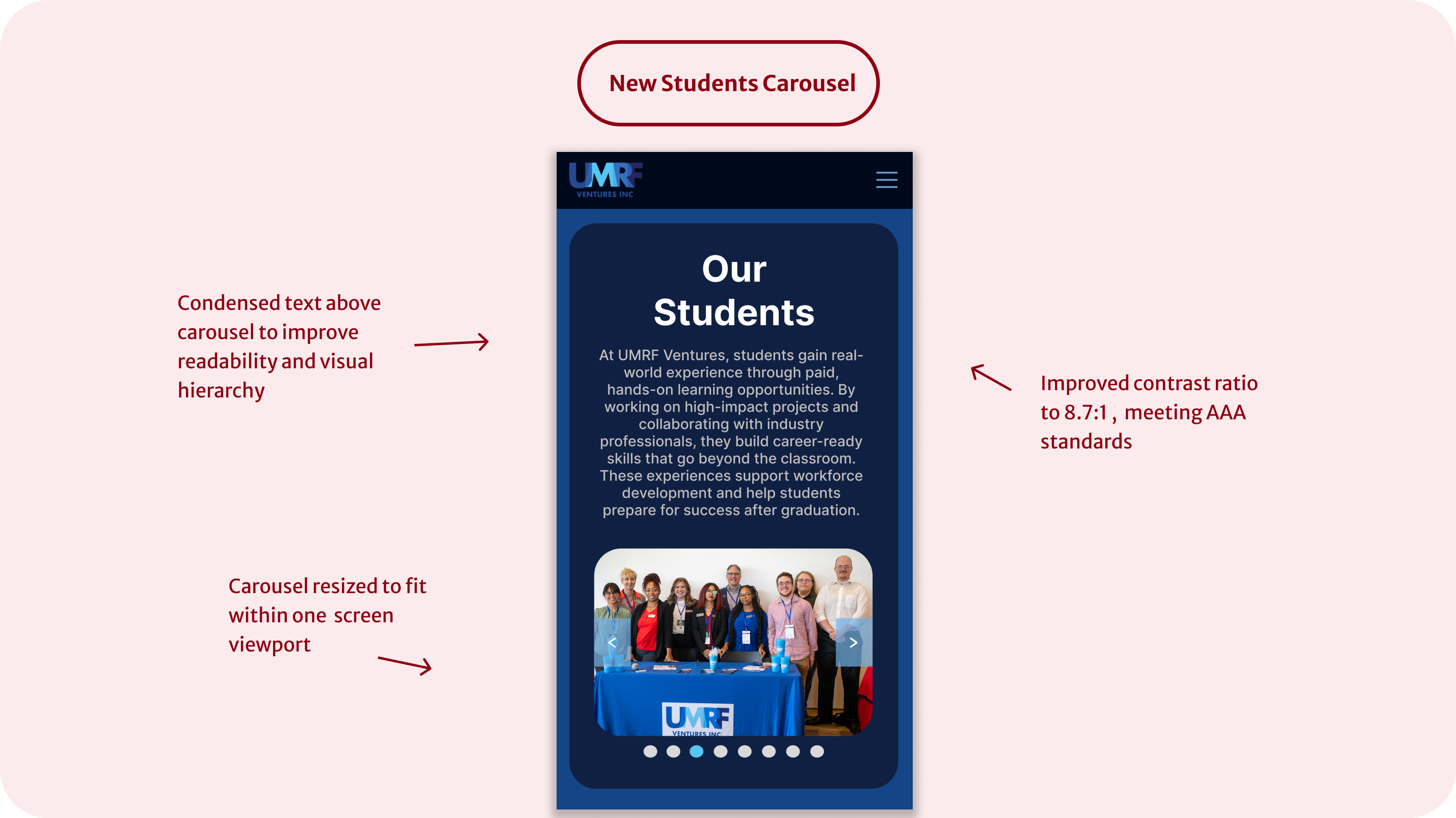
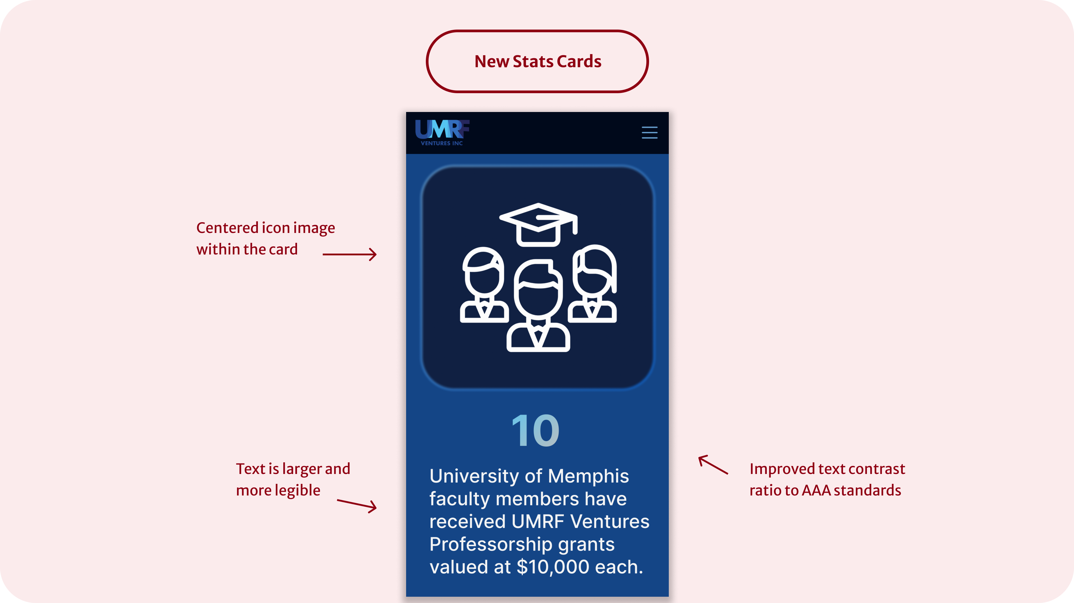
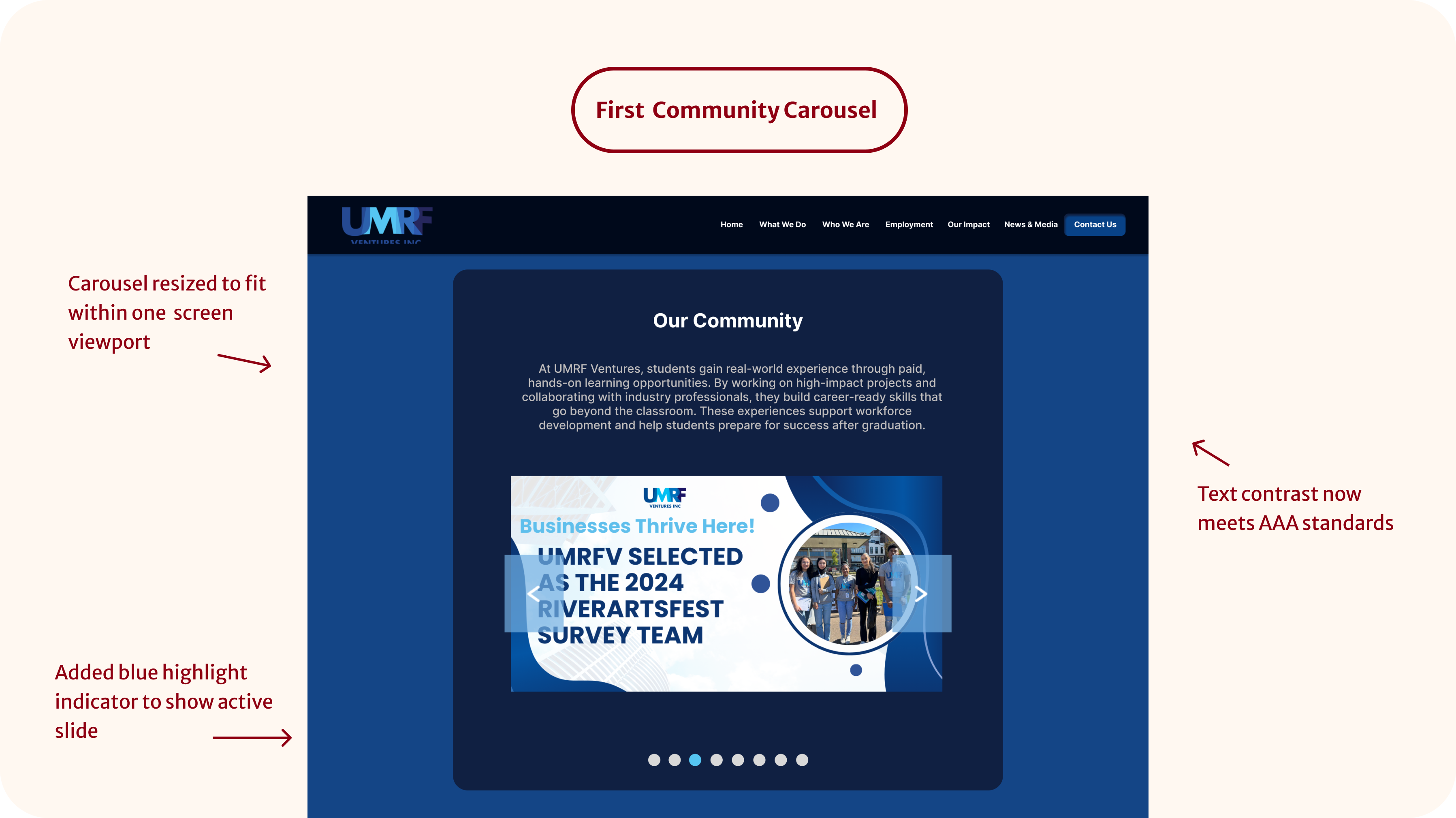
To improve usability, I resized and centered the icons in the statistics cards for better visual balance across devices. I also adjusted breakpoints to prevent layout issues on mid-sized screens. Additionally, I enhanced text and link colors that didn’t meet accessibility standards — boosting the contrast ratio from 4.62:1 to 8.7:1 to meet WCAG AAA — and added a gradient to the statistics to give them more visual emphasis.
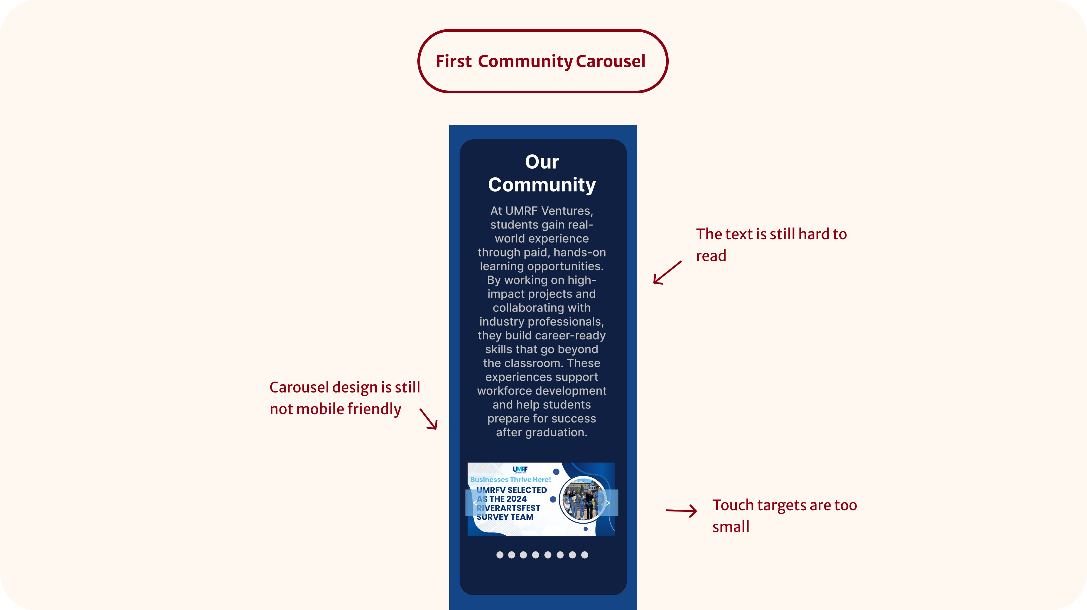
Last but not least, I turned my attention to the "Our Community" carousel. Initially, I assumed the same solution I used for the Students' carousel—resizing and simplifying—would work here too.
This carousel included links and titles, so its spacing needs were different from the Students' carousel.
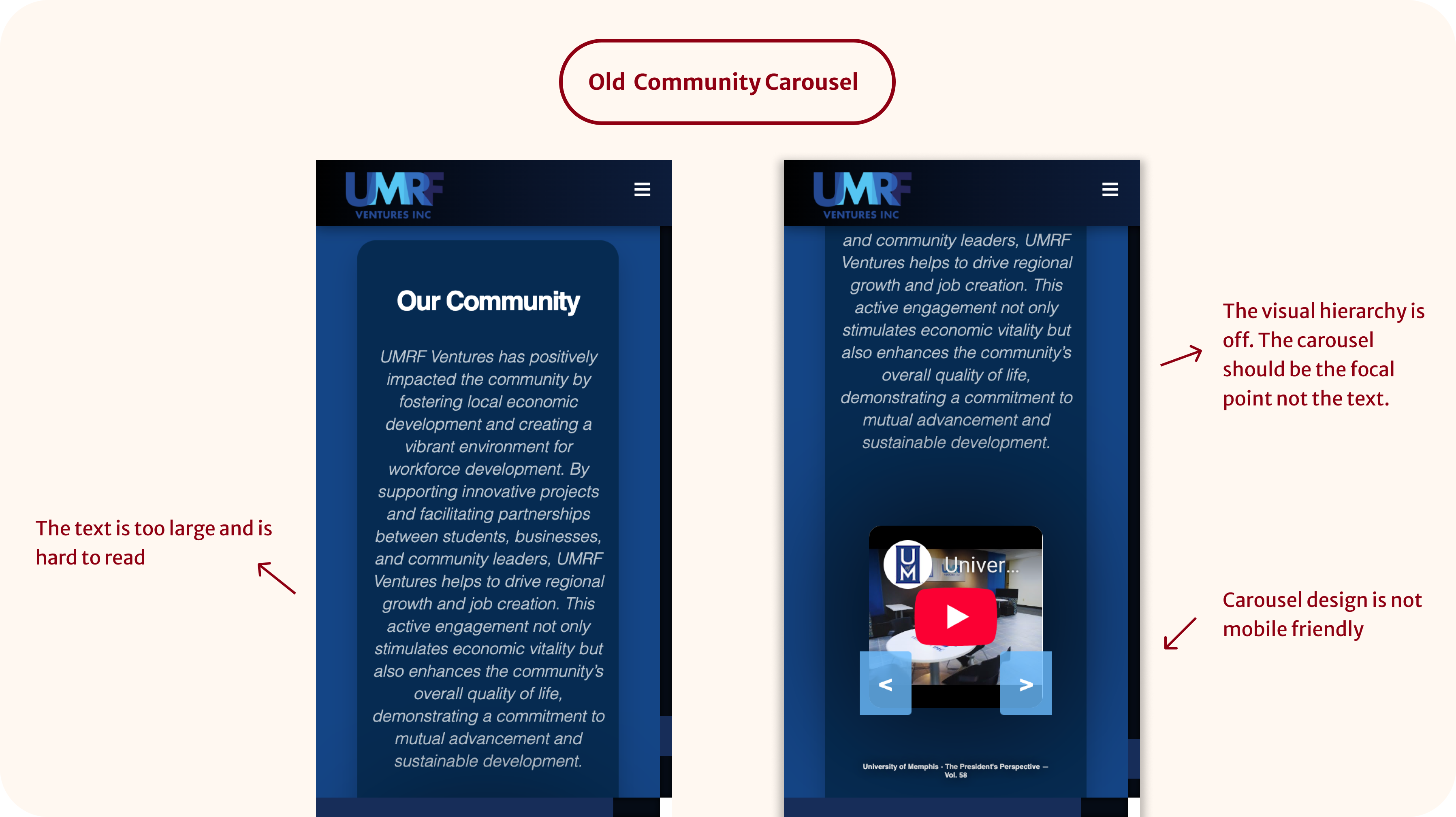
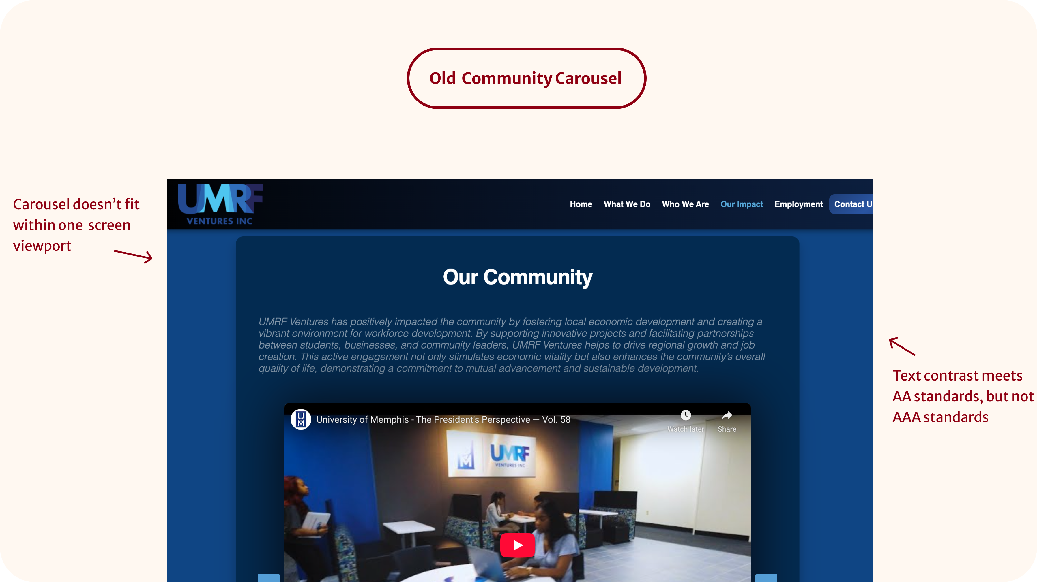
I applied the original carousel fix, but it didn't translate well due to the extra interactive elements. The visual hierarchy was still off on mobile and the carousel wasn't optimized for mobile.
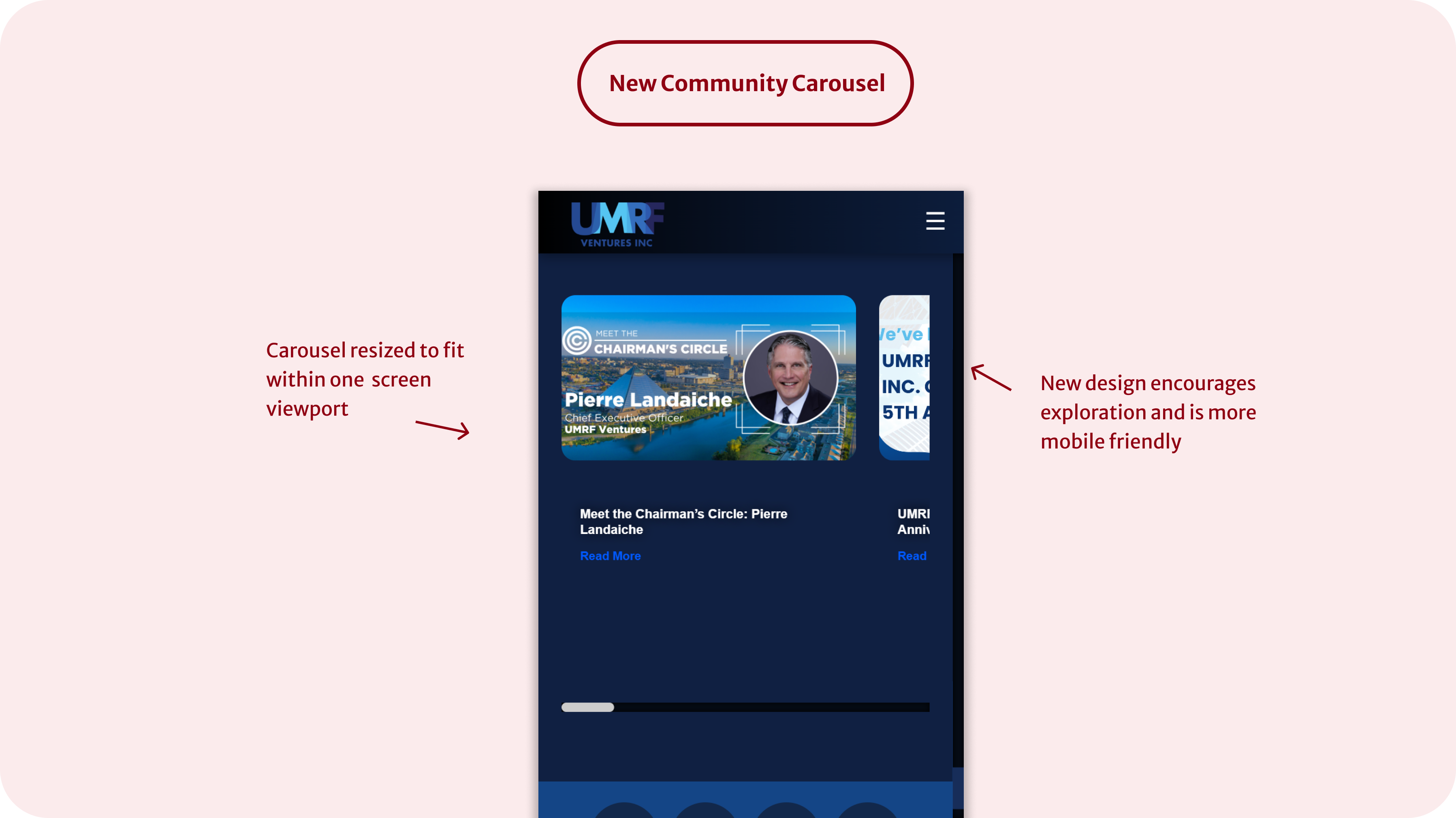
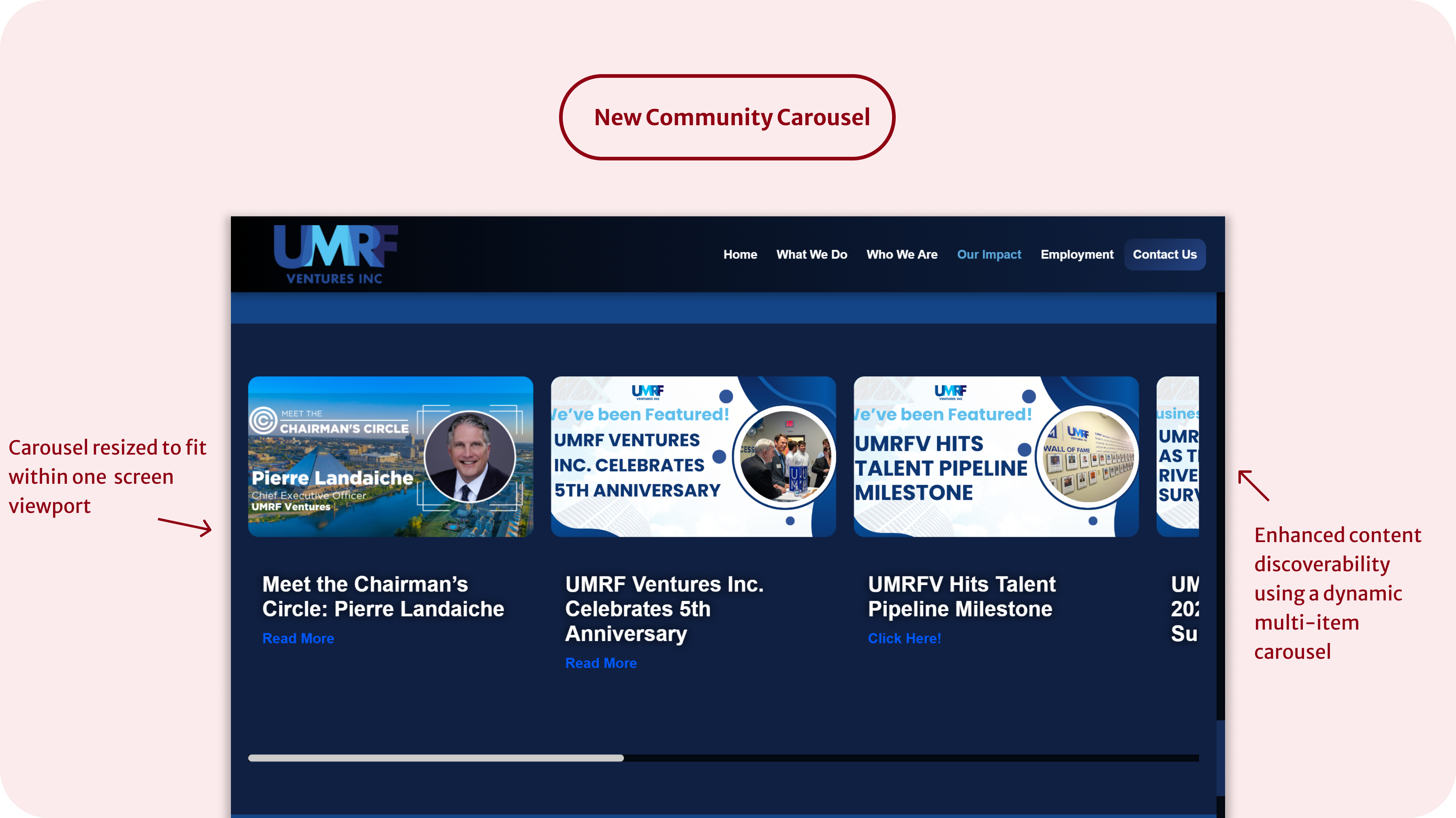
After exploring examples from other websites and design systems, I proposed a new approach: a hero-style carousel. It balances visual appeal with mobile usability while maintaining content hierarchy.
While I was able to polish specific UI elements like the stats cards and contrast ratios, I would have loved more time to experiment with alternate layouts and user testing.
If time allowed, I would’ve explored creating a lightweight style guide or reusable component set, especially for typography and spacing scales.