Charlotte & Pickens home page mockup

Summary

Charlotte & Pickens: Balancing Culture + Commerce

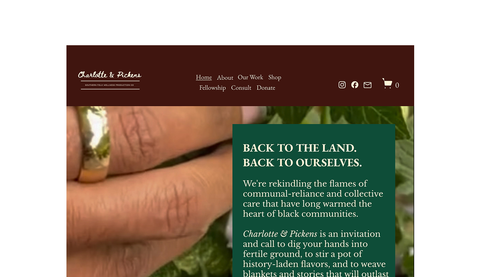
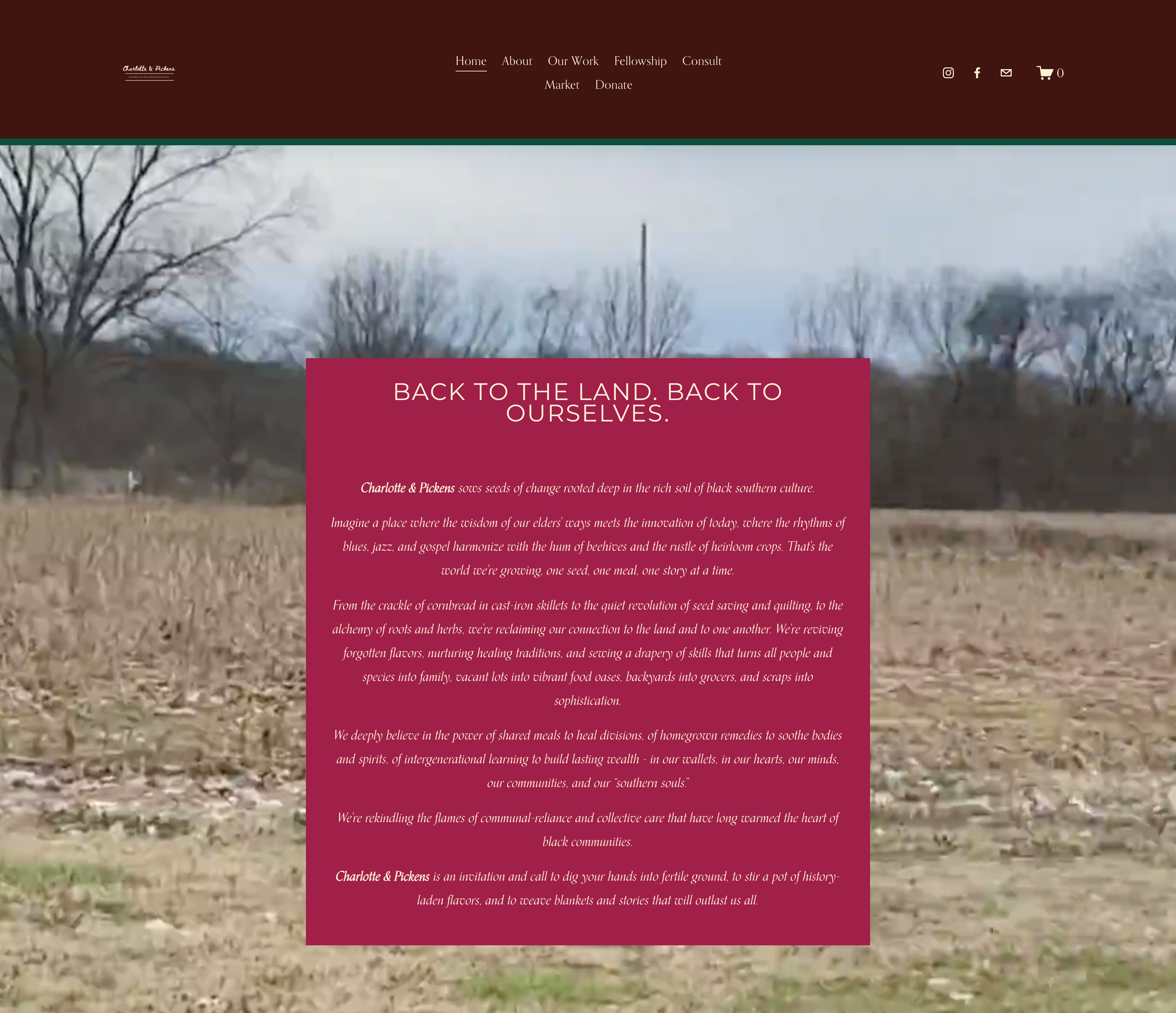
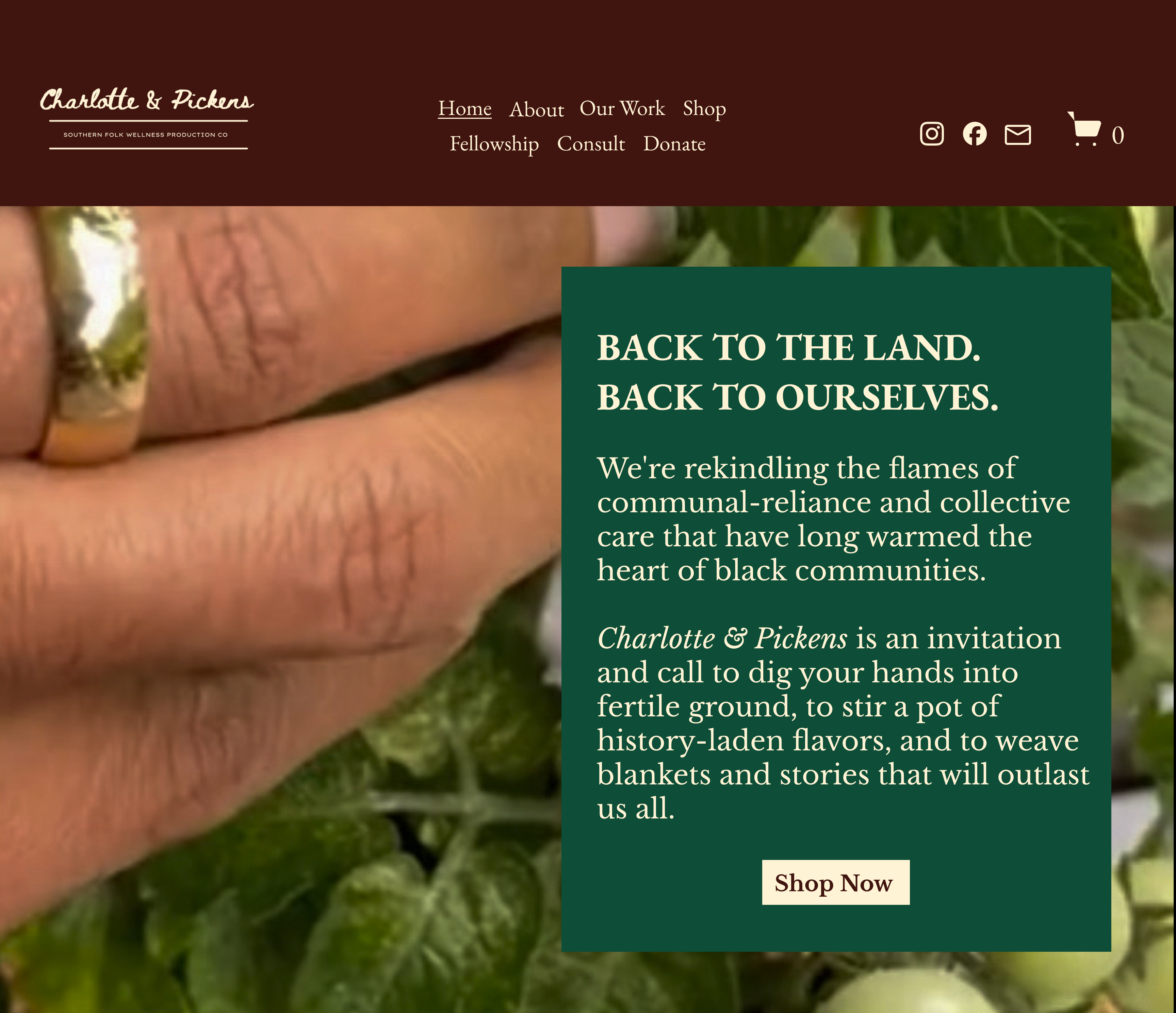
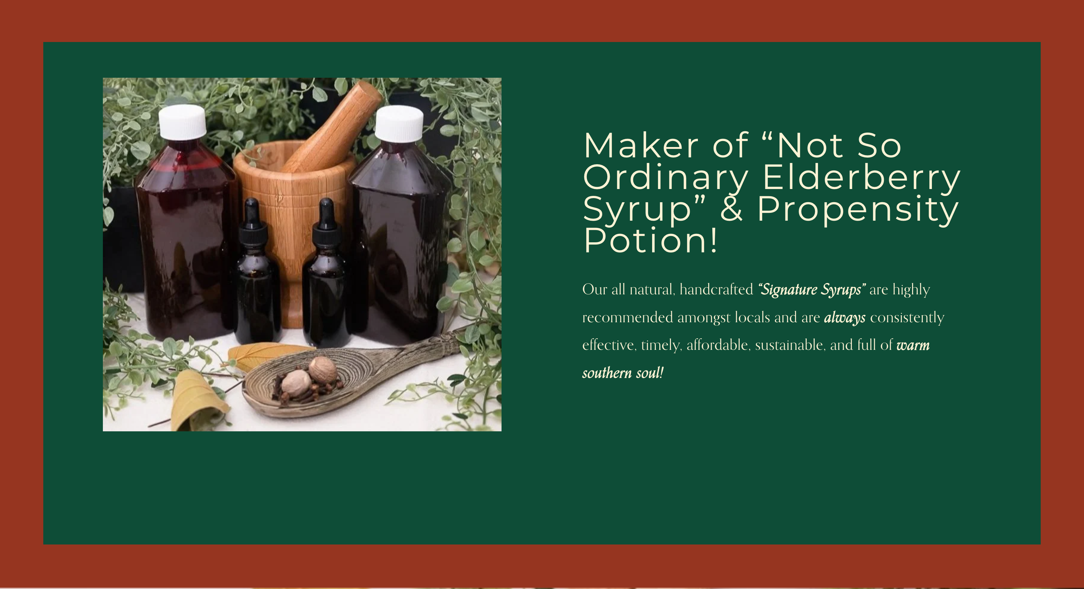
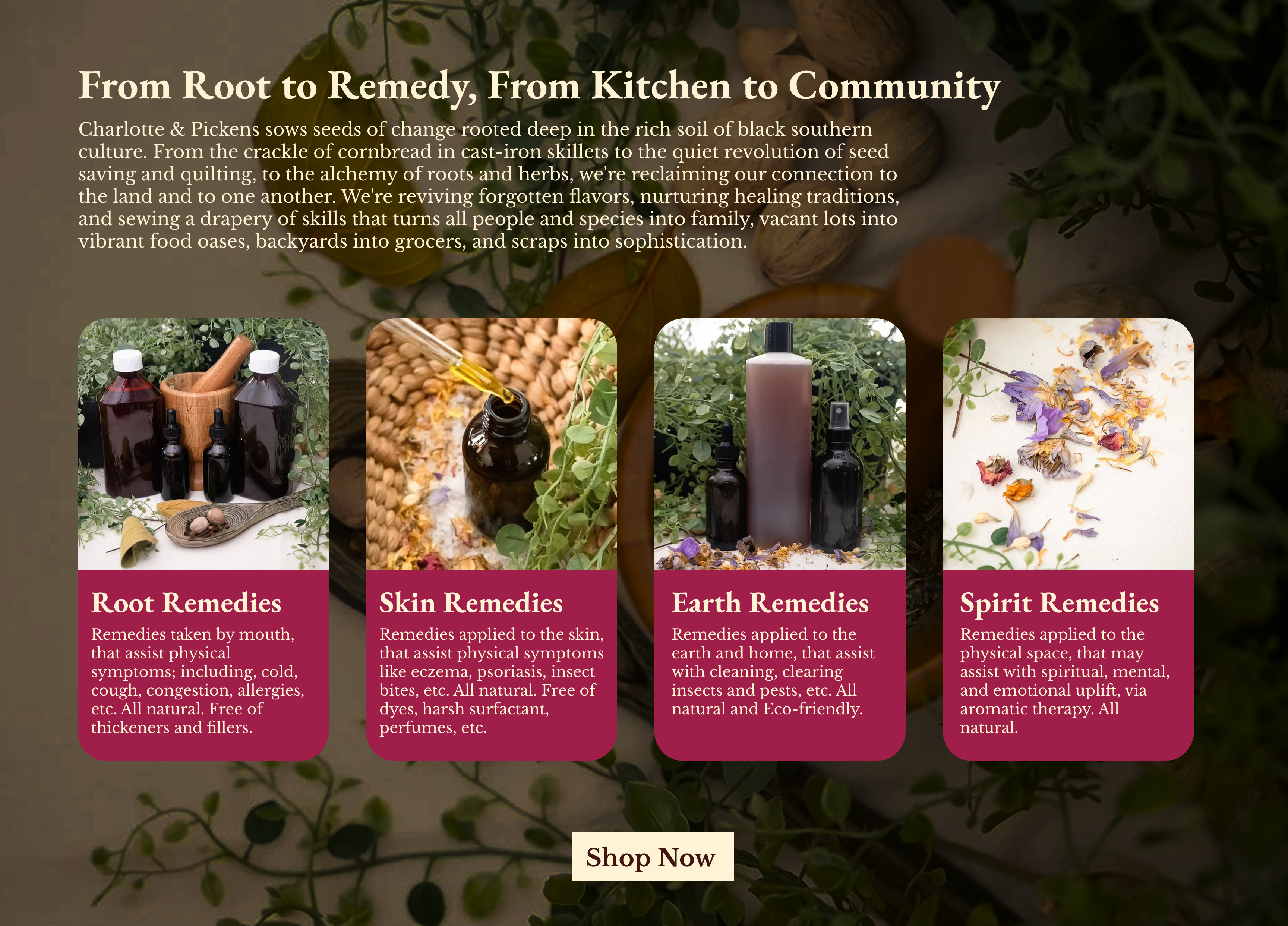
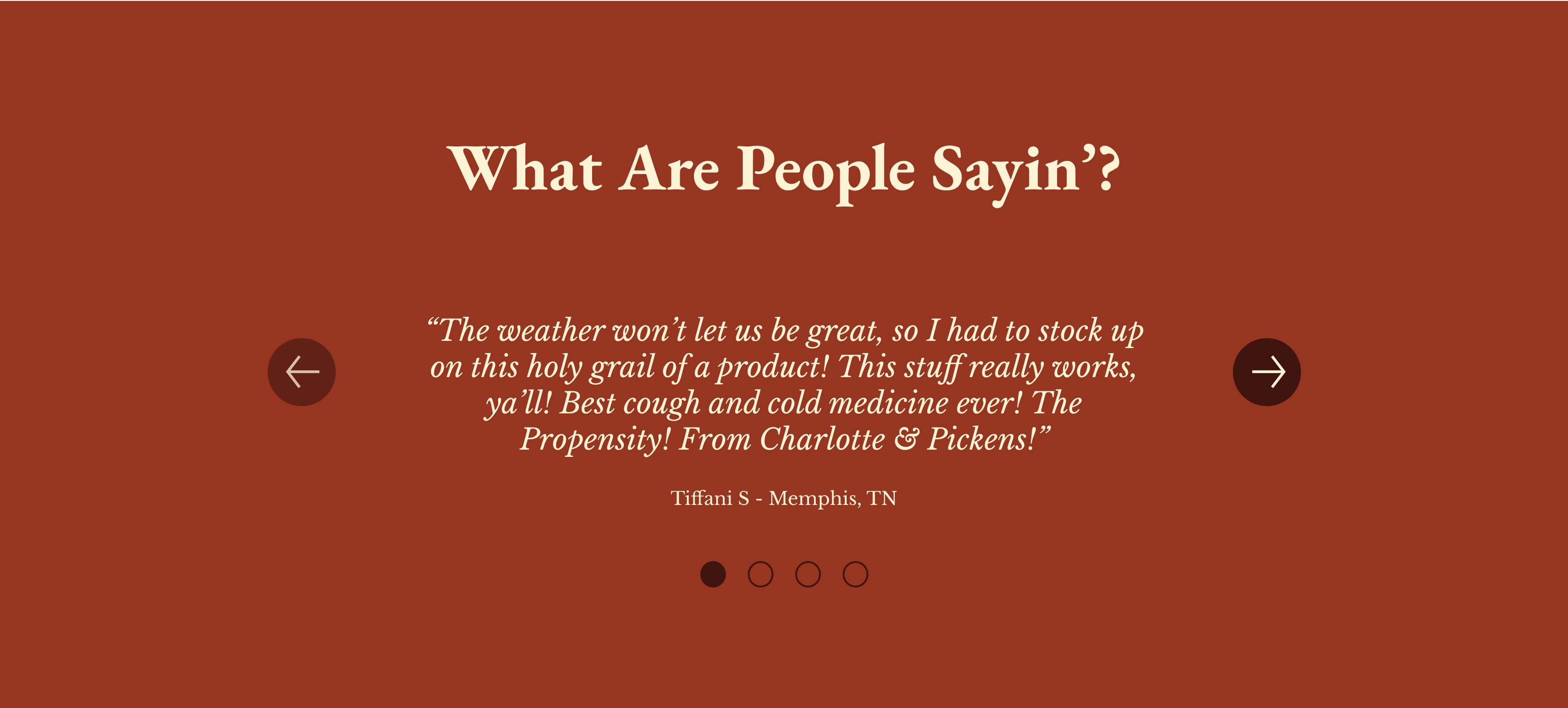
When I found Charlotte & Pickens, I didn’t immediately realize they sold herbal and wellness products — their brand story overshadowed their offerings. To fix this, I restructured the site to highlight their products sooner while keeping their cultural storytelling alive. I streamlined the information architecture, added strategic CTAs, and introduced visual hierarchy to guide users naturally from cultural context to purchase decisions.

Industry

Wellness

E-commerce

Tools

Figma

💡 Hover/Click over the dots to see specific improvements

Hero Section

Before

Charlotte & Pickens hero section before mockup
Logo is too small, reducing brand recognition
Buried CTAs and weak visual hierarchy
Text-heavy hero section

After

Charlotte & Pickens hero section after mockup
Strengthened visual hierarchy between video and text
Enhanced logo prominence for brand consistency
Condensed copy with clear above-fold CTA

Product Highlight Section

Before

Charlotte & Pickens product highlight before mockup
Poor readability with tiny text and alignment issues

After

Charlotte & Pickens product highlight after mockup
Clean, intentional layout with proper alignment
Removed the competing green background for better flow after the hero section

Products Section

Before

Charlotte & Pickens products section before mockup
Product images are small and the overall design is clunky
Text is low-contrast and difficult to read over busy background image
CTA is not standing out and blends into the background

After

Charlotte & Pickens products section after mockup
Unified card design for consistent sizing and cleaner presentation
Darkened background photo to emphasize products over visuals
Enlarged text + strengthened CTA for readability and action

News & Media Section

Before

Charlotte & Pickens news section before mockup
Cramped layout lacks visual breathing room
Disjointed organization hinders content flow

After

Charlotte & Pickens news section after mockup
Scannable 2x2 grid improves content digestion
Improved spacing and contrast for readability

Testimonials Section

Before

Charlotte & Pickens reviews section before mockup
Wall-of-text layout reduces testimonial impact
Missing visual separation between reviews

After

Charlotte & Pickens reviews section after mockup
Switched to modern, focused carousel for better engagement
Clear typographic hierarchy improves readability

Note: This was an unsolicited redesign created to demonstrate UX/UI improvements. All design work and recommendations are my own.

Thanks for reading

Check out more Projects

UMRF Ventures, Inc. work

UMRF Ventures, Inc.

Web Development UI/UX Design
delta arts case study

DeltaARTS

Web Design UX/UI Design