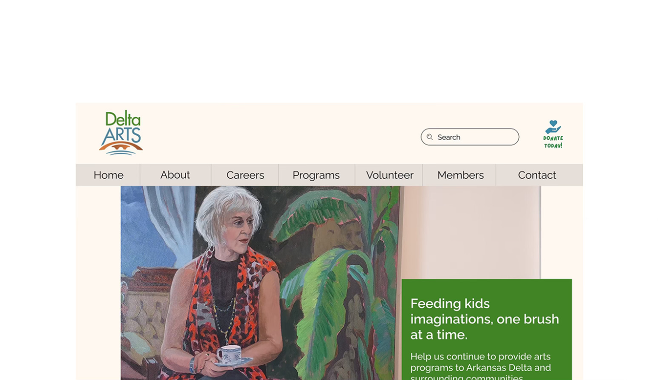
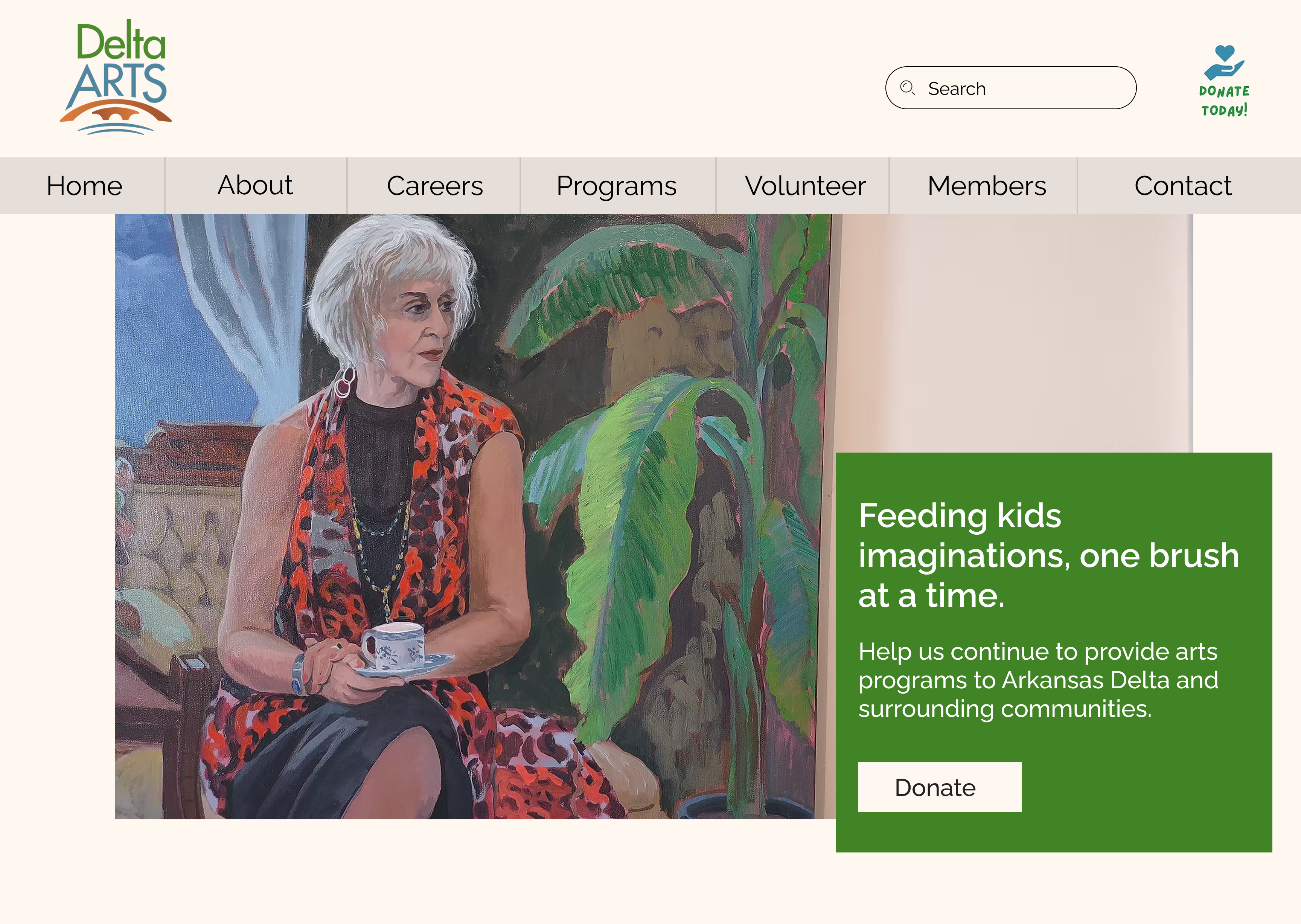
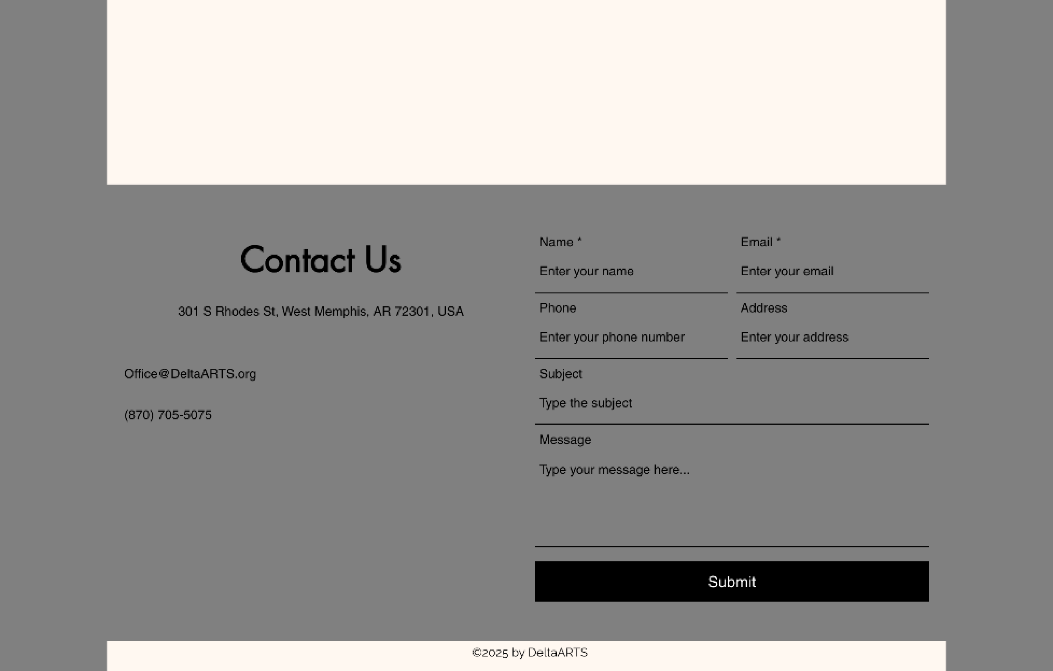
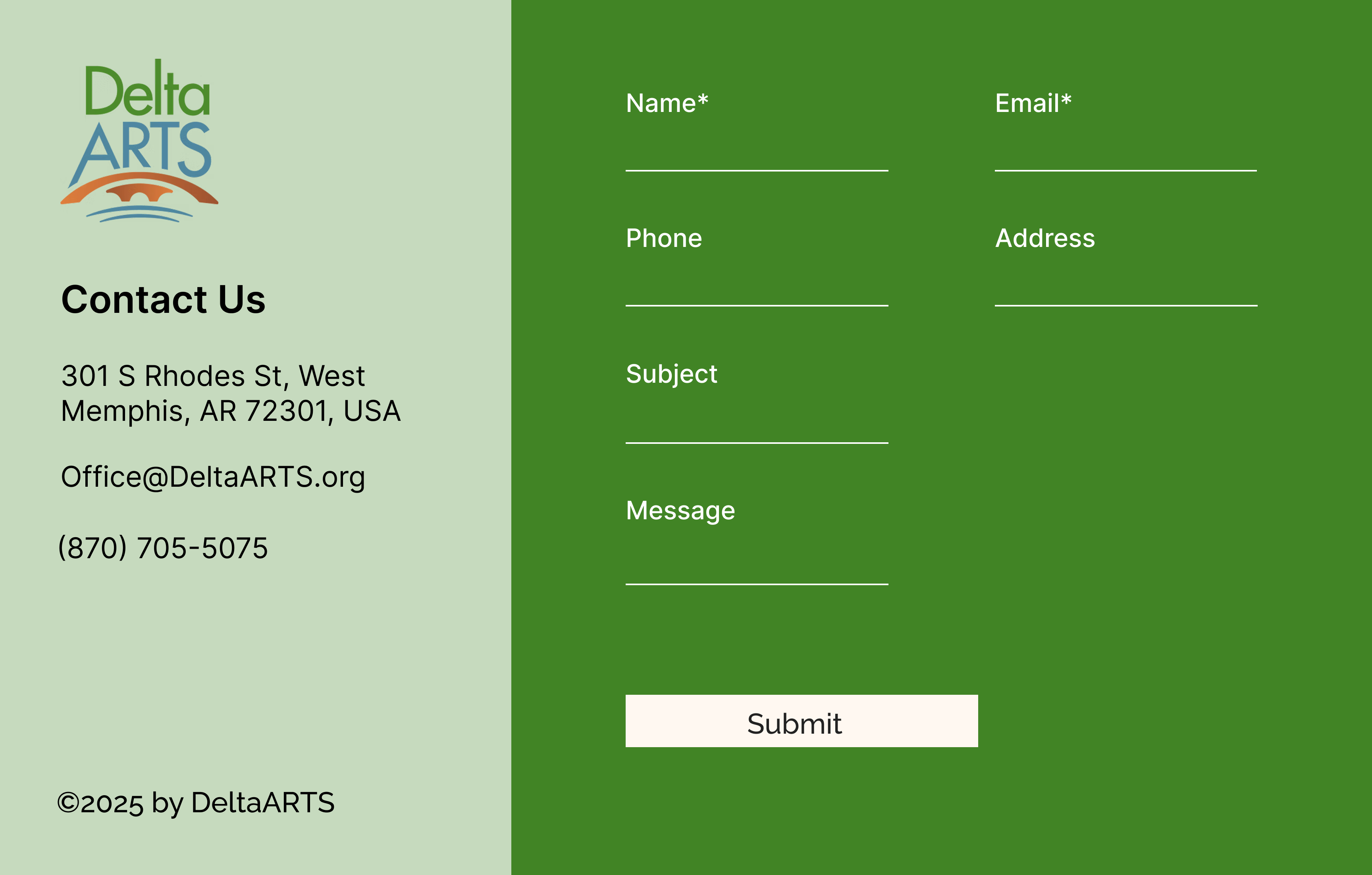
The DeltaARTS website lacked the vibrant energy of an arts organization. My redesign transformed it by injecting a bold, brand-aligned color palette and streamlining cluttered sections like events and navigation into scannable, actionable content. This included strengthening calls-to-action and consolidating five fonts into a cohesive two-font system for better hierarchy and clarity.
Non-Profit
Figma
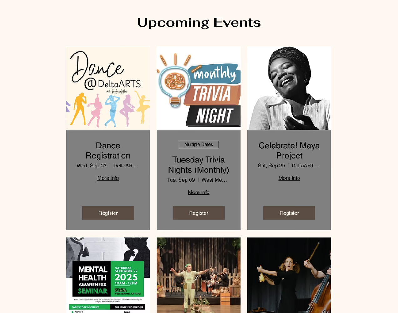
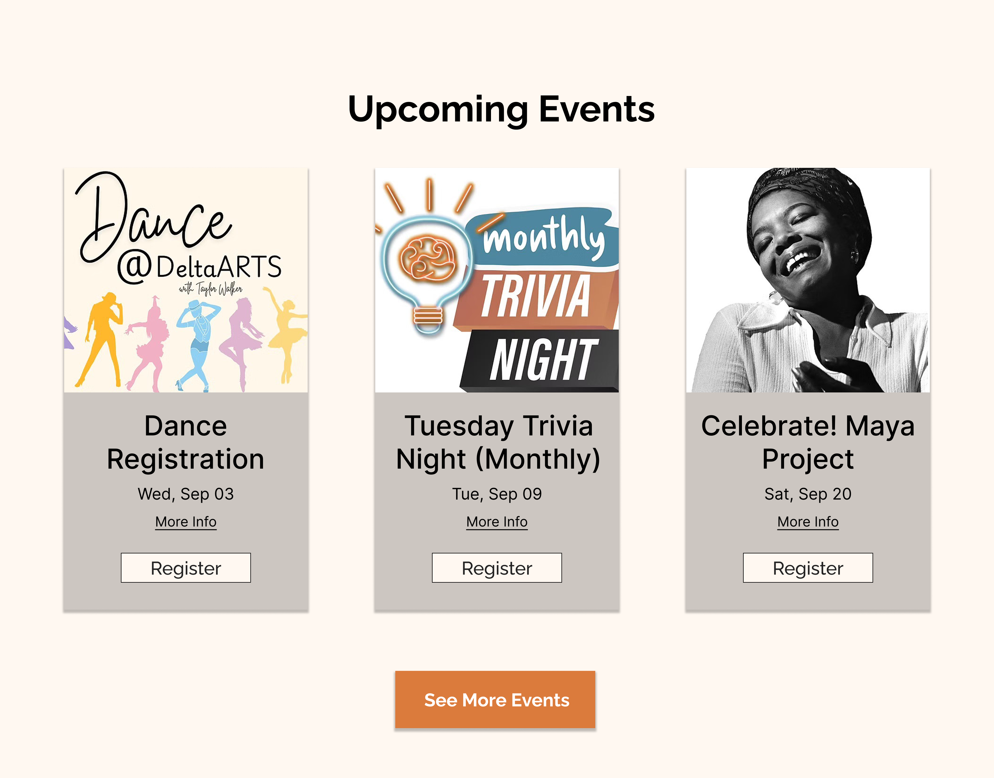
💡 Hover/Click over the dots to see specific improvements
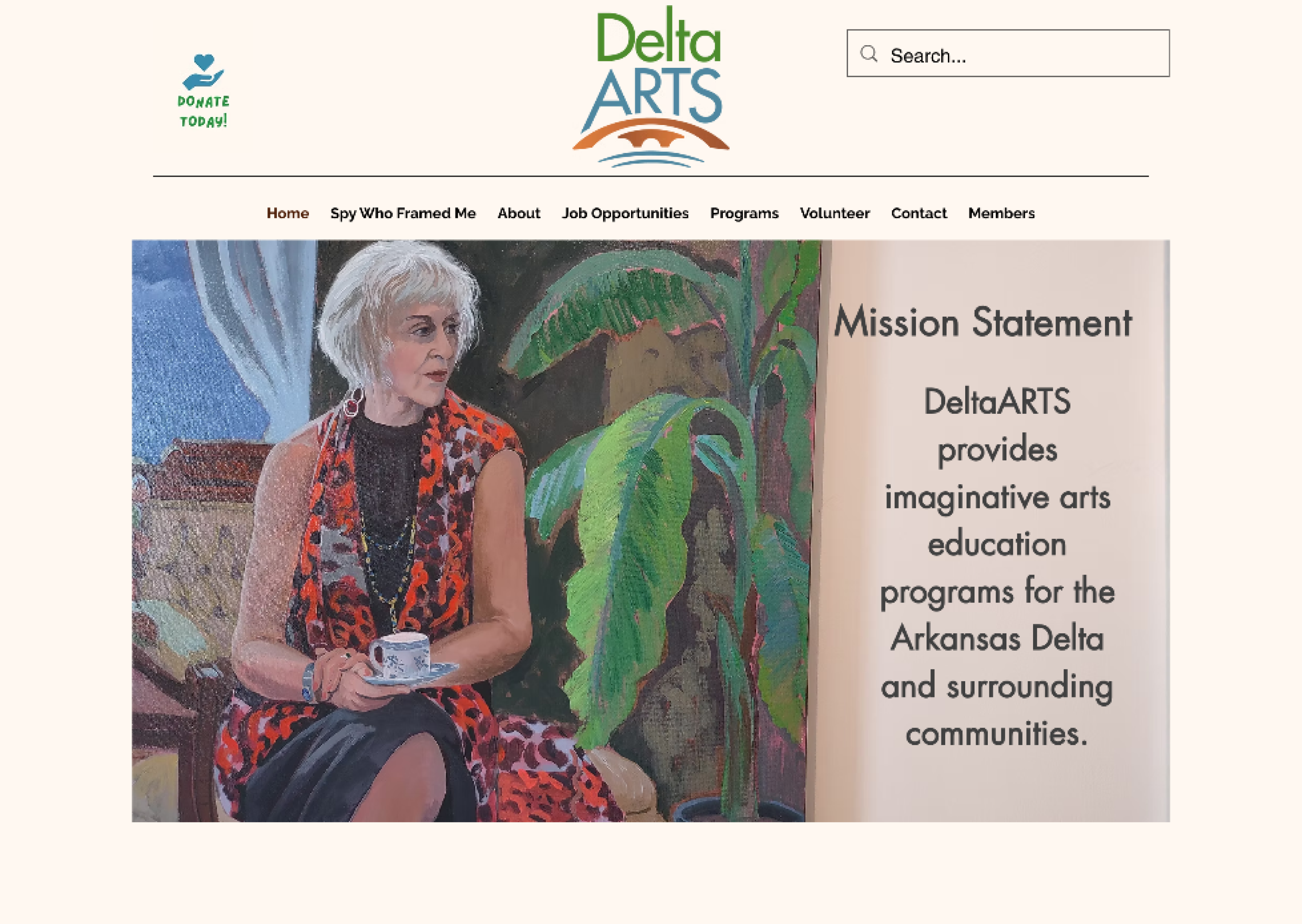
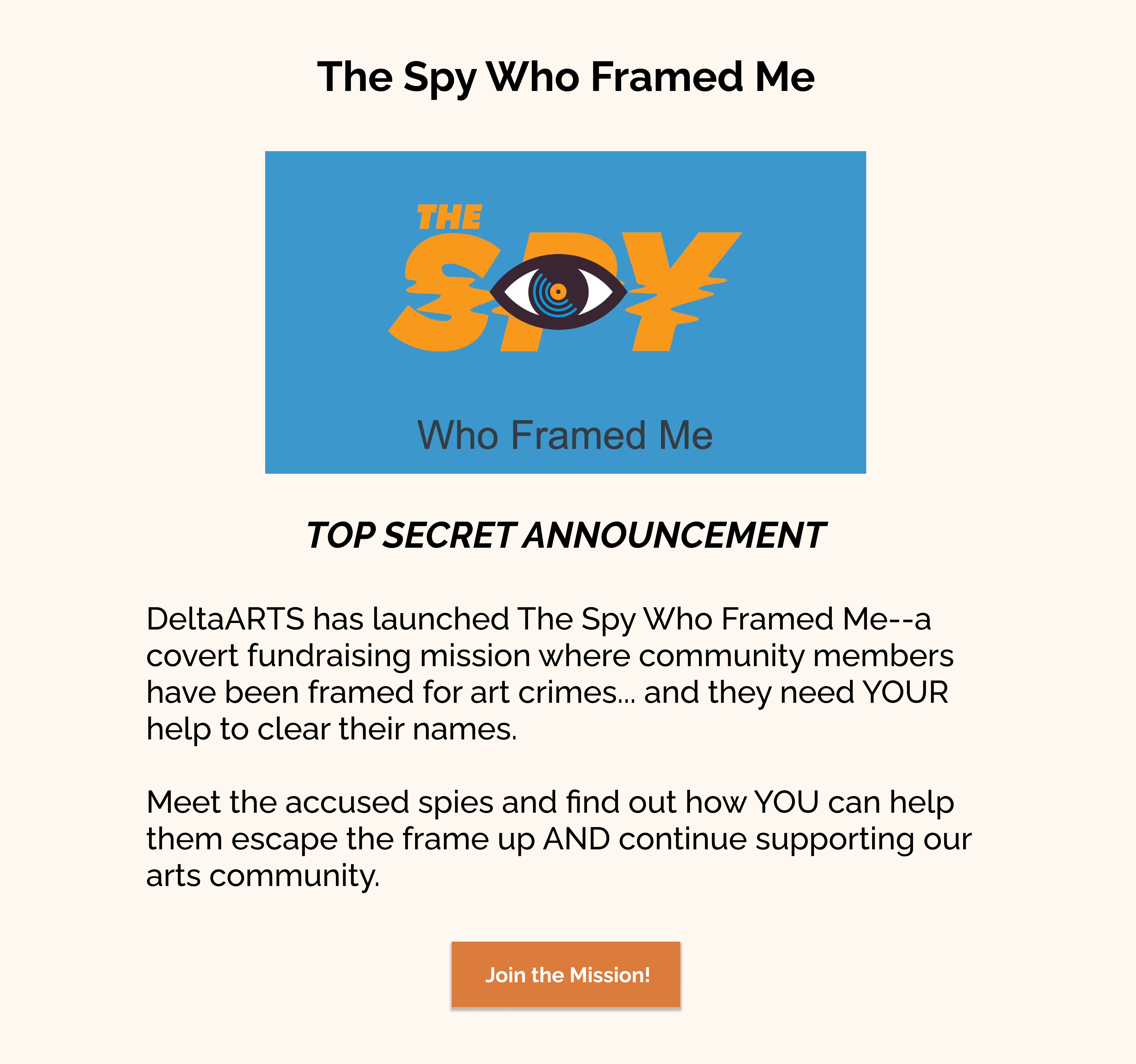
I moved "The Spy Who Framed Me" campaign from the navigation menu to a dedicated spotlight section, making it more discoverable and encouraging deeper engagement.
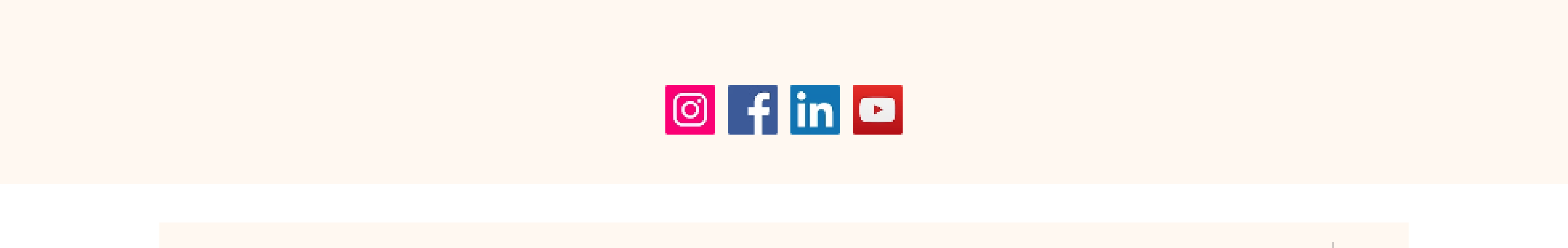
Updated social icons to align with their vibrant brand colors, creating visual consistency across all touchpoints.

Note: This was an unsolicited redesign created to demonstrate UX/UI improvements. All design work and recommendations are my own.